Divided Mask Infographic: Do's and Don'ts
This template presents a clear visual comparison using a mask graphic divided into two sections. It's ideal for highlighting best practices versus common mistakes or positive and negative aspects of a topic.
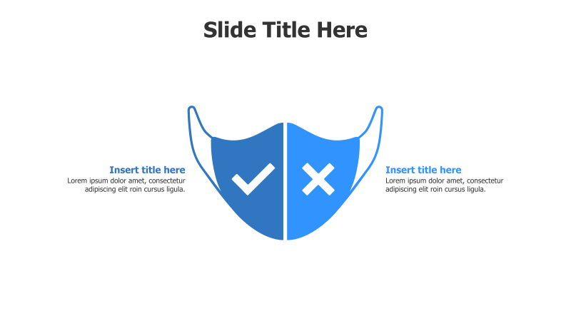
Layout & Structure:
- The slide features a central mask shape divided vertically into two equal halves.
- One half contains a checkmark, representing a positive or correct action.
- The other half contains an 'X', representing a negative or incorrect action.
- Text boxes are provided on either side of the mask for detailed explanations.
Style:
- The template utilizes a clean, modern aesthetic with a flat design.
- A bright blue color scheme is used for the mask and icons, providing good contrast.
- The overall look is professional and easily adaptable to various branding guidelines.
Use Cases:
- Presenting safety protocols (e.g., proper mask usage).
- Illustrating best practices versus common errors in a process.
- Comparing the benefits and drawbacks of different approaches.
- Highlighting do's and don'ts for a specific task or situation.
- Demonstrating acceptable and unacceptable behaviors.
Key Features:
- Visually engaging and easy to understand.
- Clear and concise presentation of contrasting ideas.
- Fully customizable colors, text, and icons.
- Suitable for a wide range of topics and audiences.
Tags:
maskinfographiccomparisondo's and don'tspositive negativechecklistsafetyprotocolbest practicesbluecleanmodern
Ready to Get Started?
Impress your audience and streamline your workflow with GraphiSlides!
Install Free Add-onNo credit card required for free plan.