Curved Line Chart Dashboard with Circular Indicators
This dashboard template presents data using a combination of circular gauges and a curved line chart, offering a visually appealing and informative overview.
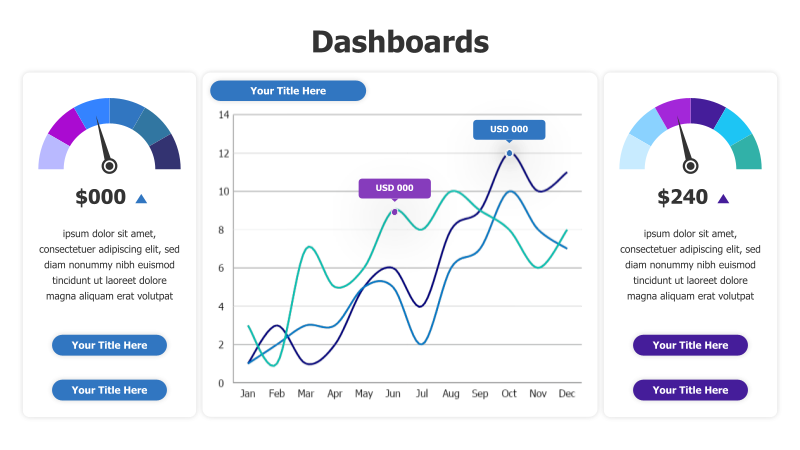
Layout & Structure: The template features a three-column layout. The left and right columns contain circular gauges displaying numerical values with upward trend indicators. A central, larger area showcases a curved line chart with two data series plotted over a monthly timeline (Jan-Dec). Each circular gauge is accompanied by descriptive text.
Style: The design employs a modern aesthetic with a cool color palette (blues and purples). The circular gauges utilize gradient fills, and the line chart features smooth curves. The overall style is clean and professional, suitable for business presentations.
Use Cases:
- Tracking key performance indicators (KPIs) over time.
- Monitoring financial data and revenue trends.
- Presenting sales performance and growth metrics.
- Visualizing website traffic and user engagement.
- Reporting on project progress and milestones.
Key Features:
- Visually engaging circular gauges for quick data interpretation.
- Clear and concise line chart for trend analysis.
- Customizable data series and labels.
- Modern and professional design.
- Easy-to-understand visual representation of data.
Tags:
Ready to Get Started?
Impress your audience and streamline your workflow with GraphiSlides!
Install Free Add-onNo credit card required for free plan.