Line Chart with Meters Dashboard
This dashboard template combines a line chart for trend analysis with several meter-style visualizations for key performance indicators (KPIs).
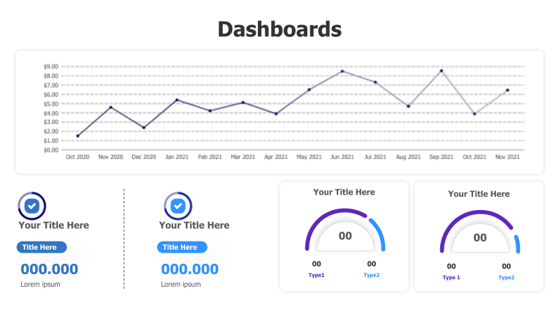
Layout & Structure: The template features a prominent line chart at the top, displaying data trends over time (Oct 2020 - Nov 2021). Below the chart, there are four distinct sections: two rectangular boxes with checkmarks and numerical values, and two circular meter-style visualizations. The layout is clean and organized, facilitating quick comprehension of key data points.
Style: The template employs a modern and professional aesthetic. The line chart uses a subtle blue color, and the meter visualizations incorporate a teal and gray color scheme. The use of rounded corners and subtle shadows adds depth and visual appeal. The overall design is minimalist, focusing on clarity and readability.
Use Cases:
- Tracking financial performance and key metrics.
- Monitoring website traffic and user engagement.
- Presenting sales data and growth trends.
- Displaying project progress and milestones.
- Reporting on operational efficiency and KPIs.
Key Features:
- Visually appealing and modern design.
- Clear and concise data presentation.
- Easy to customize with your own data.
- Effective for highlighting key performance indicators.
- Suitable for a wide range of business applications.
Tags:
Ready to Get Started?
Impress your audience and streamline your workflow with GraphiSlides!
Install Free Add-onNo credit card required for free plan.