3 Circular Minimal Charts Dashboard
This template presents three circular charts, ideal for displaying key data points in a clean and modern dashboard format.
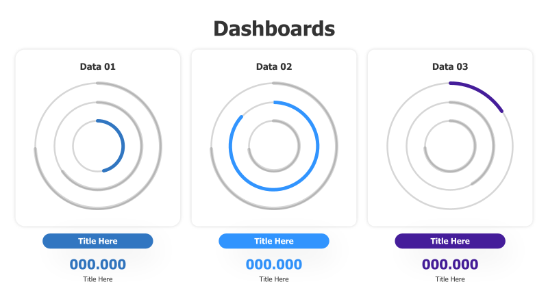
Layout & Structure: The template features three distinct circular charts arranged horizontally. Each chart consists of concentric rings, with a portion of the circle highlighted to represent a value or progress. Below each chart is a rectangular section for a title and numerical value, along with a descriptive label. The arrangement is simple and balanced, promoting easy comparison between the three data sets.
Style: The design is minimalist, utilizing a clean color palette of blues and purples against a white background. The circular charts have a subtle gradient effect, and the use of concentric rings adds depth. The overall aesthetic is professional and modern, suitable for a variety of business and data visualization applications.
Use Cases:
- Displaying key performance indicators (KPIs).
- Visualizing progress towards goals.
- Presenting data summaries in a dashboard.
- Comparing metrics across different categories.
- Highlighting important data points in a report.
Key Features:
- Clean and minimalist design.
- Easy-to-understand circular charts.
- Clear labeling and data presentation.
- Visually appealing color scheme.
- Fully customizable elements.
Tags:
Ready to Get Started?
Impress your audience and streamline your workflow with GraphiSlides!
Install Free Add-onNo credit card required for free plan.