Doughnut Charts Dashboard with Line Graph
This template presents a dashboard-style slide featuring five doughnut charts and a line graph, ideal for showcasing key metrics and data comparisons.
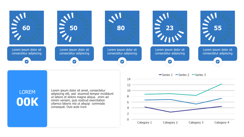
Layout & Structure: The slide is divided into two main sections. The top section contains five circular doughnut charts arranged horizontally. Each chart displays a numerical value and a brief text description. Below these, a larger section features a line graph comparing three series across four categories, accompanied by a large text block and a smaller doughnut chart.
Style: The template employs a modern and professional aesthetic. The doughnut charts utilize a vibrant blue color scheme with a 3D effect, creating visual depth. The line graph uses distinct colors for each series, enhancing clarity. The overall design is clean and uncluttered, promoting easy data interpretation.
Use Cases:
- Presenting key performance indicators (KPIs).
- Comparing data across different categories or segments.
- Visualizing progress towards goals.
- Reporting on project milestones.
- Summarizing survey results.
Key Features:
- Visually appealing doughnut charts for clear data representation.
- Line graph for trend analysis and comparison.
- Fully customizable colors, fonts, and data.
- Professional and modern design.
- Suitable for a wide range of business presentations.
Tags:
Ready to Get Started?
Impress your audience and streamline your workflow with GraphiSlides!
Install Free Add-onNo credit card required for free plan.