Data Dashboard with Column Chart
This template presents a data-driven dashboard with a combination of numerical displays and a column chart visualization.
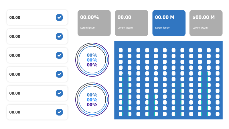
Layout & Structure: The template features a vertical list of six data points on the left, each with a numerical value and a checkmark icon. To the right of these, there are four rectangular blocks displaying percentage, numerical, and monetary values. A column chart occupies the right side, composed of a grid of dots, with varying shades of blue and teal to represent data intensity. The layout is designed for presenting key metrics and performance indicators.
Style: The template employs a clean and modern aesthetic with a predominantly blue and white color scheme. The use of rounded rectangles and a dot-matrix column chart provides a contemporary feel. The overall style is professional and suitable for business presentations.
Use Cases:
- Presenting key performance indicators (KPIs).
- Displaying project progress and milestones.
- Visualizing financial data and metrics.
- Reporting on sales performance and revenue.
- Showcasing website traffic and user engagement.
Key Features:
- Clear and concise data presentation.
- Visually appealing column chart.
- Modern and professional design.
- Easy to customize with your own data.
Tags:
Ready to Get Started?
Impress your audience and streamline your workflow with GraphiSlides!
Install Free Add-onNo credit card required for free plan.