3-Tier Comparison with Line Charts
This template presents a three-tiered comparison using curved stripes and accompanying line charts. It's ideal for showcasing trends, progress, or data across different categories.
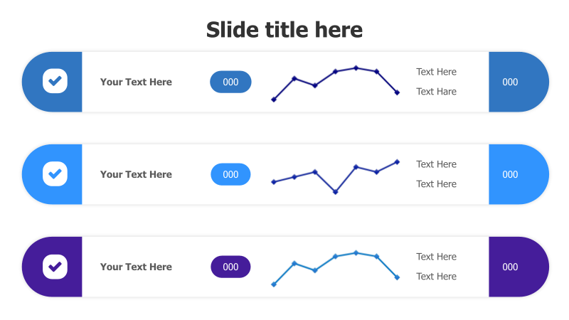
Layout & Structure: The template features three horizontal stripes, each with a distinct color (blue, purple, and a lighter blue). Each stripe contains a checkmark icon, placeholder text, a small circular element with "000", a line chart, and another circular element with "000". The line charts provide a visual representation of data trends within each tier.
Style: The design incorporates a modern aesthetic with rounded corners and subtle gradients. The use of color variation helps differentiate the tiers, while the line charts add a data-driven element. The overall look is clean and professional.
Use Cases:
- Comparing performance metrics across different departments.
- Illustrating project progress over time for multiple initiatives.
- Presenting sales data for different product lines.
- Highlighting key trends in market research.
- Showcasing the evolution of a process or strategy.
Key Features:
- Visually appealing and modern design.
- Clear and concise data presentation.
- Fully customizable colors, text, and charts.
- Easy to understand and interpret.
- Suitable for a wide range of business presentations.
Tags:
Ready to Get Started?
Impress your audience and streamline your workflow with GraphiSlides!
Install Free Add-onNo credit card required for free plan.