Minimal Pie Charts Dashboard
This template presents key metrics using a clean and modern dashboard layout.
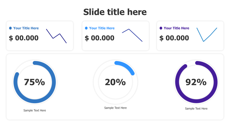
Layout & Structure: The template features a three-column, two-row grid. The top row displays monetary values with trend indicators, while the bottom row showcases three circular progress charts. Each chart is accompanied by a title and descriptive text.
Style: The design employs a minimalist aesthetic with a light background and vibrant blue and purple accents. The charts utilize a clean, circular design with bold percentage displays. The overall style is professional and easy to understand.
Use Cases:
- Presenting key performance indicators (KPIs).
- Displaying project progress and completion rates.
- Visualizing market share or sales data.
- Reporting on financial metrics and trends.
- Summarizing survey results or customer feedback.
Key Features:
- Clean and modern design.
- Easy-to-understand visual representation of data.
- Fully customizable colors and text.
- Suitable for a wide range of business presentations.
Tags:
pie chartdashboardmetricskpiprogressminimalistmoderndata visualizationbusinessreportpercentagefinancial
Ready to Get Started?
Impress your audience and streamline your workflow with GraphiSlides!
Install Free Add-onNo credit card required for free plan.