Colored Percentage Dashboards with Icons
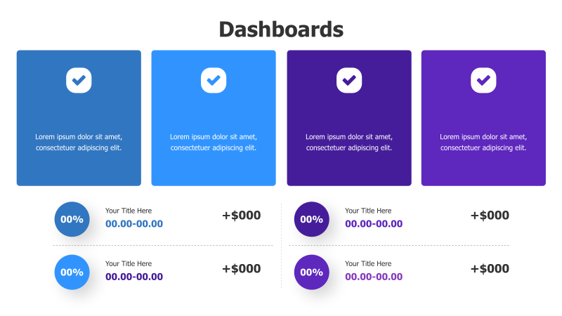
This template presents data using four distinct colored dashboard sections, each featuring a prominent checkmark icon and percentage indicators.
Layout & Structure: The template is divided into four rectangular sections arranged in a horizontal row. Each section contains a large checkmark icon, descriptive text, and two sets of percentage/value indicators. The layout is clean and emphasizes key metrics.
Style: The design utilizes a vibrant color gradient (blue to purple) across the four sections, creating a visually appealing and modern aesthetic. The use of icons and clear typography enhances readability. A subtle dotted line separates the upper and lower data sections.
Use Cases:
- Presenting key performance indicators (KPIs).
- Displaying progress towards goals.
- Summarizing project status.
- Reporting on financial metrics.
- Highlighting key achievements.
Key Features:
- Visually engaging color scheme.
- Clear and concise data presentation.
- Easy to customize with your own data and icons.
- Suitable for a variety of business and analytical presentations.
Tags:
Ready to Get Started?
Impress your audience and streamline your workflow with GraphiSlides!
Install Free Add-onNo credit card required for free plan.