Circular and Flat Indicators Dashboard
This template presents a dashboard layout utilizing circular indicators and flat design elements to showcase key metrics and data points.
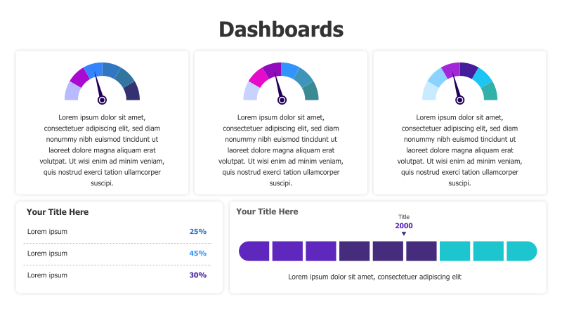
Layout & Structure:
- The template features three main sections arranged horizontally, each containing a circular gauge chart and accompanying text.
- Below the circular charts, there are two additional sections. The first displays a list of metrics with percentage values, and the second features a horizontal bar chart with a dropdown menu.
- The overall structure is clean and organized, designed for easy data visualization.
Style:
- The template employs a flat design aesthetic with vibrant color gradients within the circular gauges.
- The use of rounded corners and a light background contributes to a modern and approachable look.
- The color scheme is visually appealing and helps to highlight key data points.
Use Cases:
- Presenting key performance indicators (KPIs).
- Displaying project progress and status.
- Visualizing data analytics and metrics.
- Creating executive dashboards for reporting.
- Monitoring system performance and health.
Key Features:
- Visually engaging circular gauge charts.
- Clear and concise data presentation.
- Modern and flat design aesthetic.
- Fully customizable colors and text.
- Easy-to-understand data visualization.
Tags:
dashboardcircularindicatorsflat designmetricskpidata visualizationprogressreportinganalytics
Ready to Get Started?
Impress your audience and streamline your workflow with GraphiSlides!
Install Free Add-onNo credit card required for free plan.