Unbalanced Comparison Infographic
This template visually represents a comparison between two concepts, highlighting an imbalance or disparity.
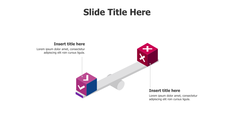
Layout & Structure: The slide features two 3D blocks positioned on opposite ends of a seesaw-like structure. One block is red with negative symbols, while the other is blue with positive symbols, visually representing opposing ideas or outcomes. The unbalanced positioning emphasizes a difference in weight or importance. There are text placeholders for titles and descriptions associated with each block.
Style: The template utilizes a modern aesthetic with a 3D effect, subtle shadows, and a gradient color scheme. The color contrast between the red and blue blocks draws attention to the comparison. The overall design is clean and professional.
Use Cases:
- Presenting pros and cons.
- Illustrating risks versus rewards.
- Comparing strengths and weaknesses.
- Highlighting problems and solutions.
- Demonstrating the impact of different choices.
Key Features:
- Visually impactful 3D design.
- Clear representation of imbalance.
- Easy-to-understand comparison.
- Fully customizable text and colors.
- Suitable for a variety of business and educational presentations.
Tags:
Ready to Get Started?
Impress your audience and streamline your workflow with GraphiSlides!
Install Free Add-onNo credit card required for free plan.