Doughnut Chart with Project Table Dashboard
This slide combines a visually engaging doughnut chart with a detailed project table for a comprehensive data presentation.
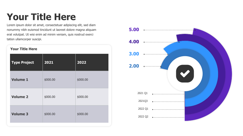
Layout & Structure: The slide is divided into two main sections. The left side features a title and a table displaying project data across two years (2021 & 2022) categorized by volume. The right side showcases a doughnut chart with a central checkmark icon, accompanied by a timeline indicating quarterly data points (2021 Q1, 2021 Q3, 2022 Q1, 2022 Q2).
Style: The template employs a modern aesthetic with a dark background and contrasting purple and blue color scheme. The doughnut chart utilizes a gradient effect, and the table has a clean, minimalist design. The overall look is professional and data-driven.
Use Cases:
- Presenting project performance metrics.
- Tracking key performance indicators (KPIs) over time.
- Comparing data across different periods.
- Visualizing progress towards goals.
- Reporting on financial performance.
Key Features:
- Clear data visualization with a doughnut chart.
- Detailed project table for specific data points.
- Modern and professional design.
- Fully customizable elements.
- Effective for presenting both overview and detailed information.
Tags:
Ready to Get Started?
Impress your audience and streamline your workflow with GraphiSlides!
Install Free Add-onNo credit card required for free plan.