Two-Point Comparison Slide
This template is designed for visually comparing two distinct points or ideas. It utilizes a clean, split-screen layout to present information side-by-side.
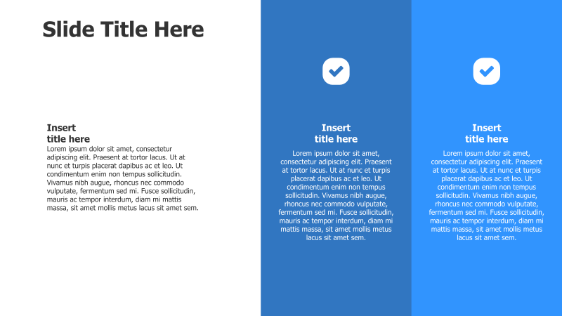
Layout & Structure: The slide is divided into three vertical sections. The central section features a title area, while the left and right sections each contain a title and a block of text accompanied by a checkmark icon. This structure facilitates a direct comparison of two concepts.
Style: The template employs a modern aesthetic with a blue and white color scheme. The use of a solid background color and clear typography contributes to a professional look. The checkmark icons add a visual cue for positive attributes or completed steps.
Use Cases:
- Comparing product features.
- Highlighting the pros and cons of different strategies.
- Presenting two alternative solutions.
- Contrasting different approaches to a problem.
- Showcasing before-and-after scenarios.
Key Features:
- Simple and easy-to-understand layout.
- Visually appealing design.
- Clear distinction between the two points.
- Fully customizable text and colors.
- Suitable for a wide range of topics.
Tags:
Ready to Get Started?
Impress your audience and streamline your workflow with GraphiSlides!
Install Free Add-onNo credit card required for free plan.