6-Level Performance Gauge Chart
This template features a gauge chart designed to visually represent performance levels or ratings.
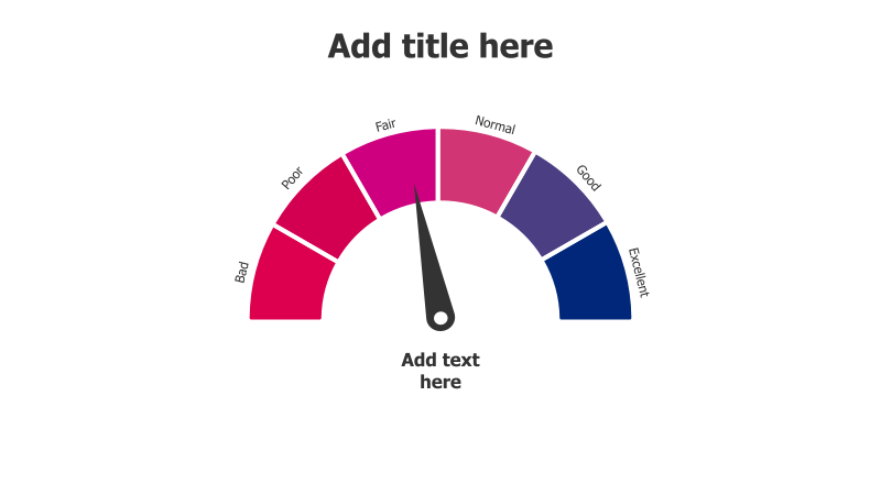
Layout & Structure: The slide showcases a semi-circular gauge divided into six distinct sections, each representing a different performance level: Bad, Poor, Fair, Normal, Good, and Excellent. A pointer indicates the current performance level. The layout is clean and focuses attention on the gauge itself.
Style: The template employs a gradient color scheme transitioning from red (Bad) to blue (Excellent), providing a clear visual indication of performance quality. The use of a dark gray pointer and simple text labels contributes to a professional and easily understandable aesthetic.
Use Cases:
- Performance reviews and evaluations
- Project status reporting
- Customer satisfaction ratings
- Risk assessment
- KPI dashboards
- Progress tracking
Key Features:
- Clear and intuitive visual representation
- Easy-to-understand performance levels
- Fully customizable colors and labels
- Visually appealing gradient design
- Suitable for a wide range of performance metrics
Tags:
Ready to Get Started?
Impress your audience and streamline your workflow with GraphiSlides!
Install Free Add-onNo credit card required for free plan.