8-Point Technology Comparison Infographic
This template presents a visually engaging way to compare multiple elements or concepts, highlighting key features and outcomes.
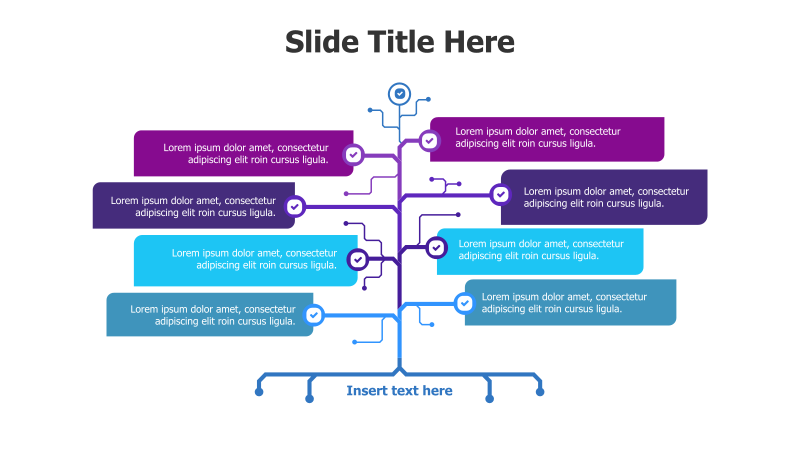
Layout & Structure: The template features a central branching structure with eight distinct points radiating outwards. Each point is represented by a colored rectangle connected to the central flow via curved lines. A curved arrow at the top indicates a starting point or overall direction, and a curved bracket at the bottom provides space for concluding remarks. The arrangement creates a clear visual hierarchy, guiding the viewer's eye from the central idea to its various components.
Style: The design incorporates a modern aesthetic with a clean color palette (purple, teal, blue). Subtle gradients and rounded corners on the rectangles add depth and visual appeal. Checkmark icons within each point emphasize completion or positive outcomes. The overall style is professional and suitable for business presentations.
Use Cases:
- Comparing different technologies or products.
- Illustrating the steps in a complex process.
- Presenting the key features of multiple solutions.
- Analyzing the pros and cons of various options.
- Showcasing the benefits of a multi-faceted strategy.
Key Features:
- Fully editable shapes and text.
- Clear visual hierarchy for easy understanding.
- Engaging branching design.
- Professional color scheme.
- Suitable for a wide range of business topics.
Tags:
Ready to Get Started?
Impress your audience and streamline your workflow with GraphiSlides!
Install Free Add-onNo credit card required for free plan.