6-Level Meter Charts
This template features six circular meter charts, ideal for visualizing performance metrics or progress across different categories.
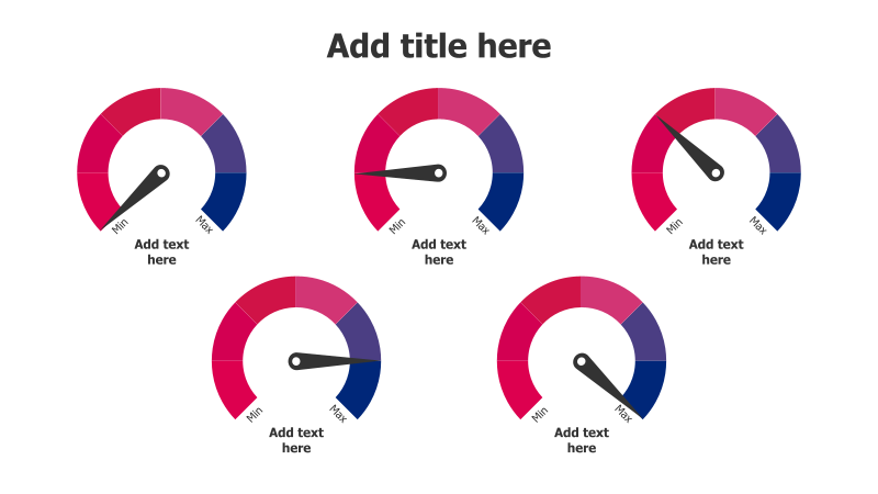
Layout & Structure: The slide displays six individual meter gauges arranged in a 2x3 grid. Each gauge has a semi-circular arc representing a scale from 'Min' to 'Max', with a pointer indicating a current value. There's space below each gauge for descriptive text.
Style: The template utilizes a modern aesthetic with a gradient color scheme within each meter. The gauges are flat with a subtle shadow effect, providing a clean and professional look. The color palette consists of shades of pink and purple.
Use Cases:
- Tracking key performance indicators (KPIs).
- Visualizing progress towards goals.
- Comparing performance across different departments or teams.
- Presenting survey results or customer satisfaction scores.
- Illustrating risk levels or project status.
Key Features:
- Fully customizable gauges.
- Clear visual representation of data.
- Easy-to-understand scale.
- Space for detailed explanations.
- Modern and professional design.
Tags:
Ready to Get Started?
Impress your audience and streamline your workflow with GraphiSlides!
Install Free Add-onNo credit card required for free plan.