6-Level Radial Meter Diagram
This template features a series of six radial meters, ideal for visualizing data or progress across multiple categories.
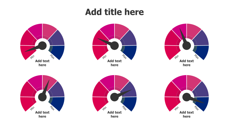
Layout & Structure: The slide consists of six circular gauges arranged in a 2x3 grid. Each gauge is divided into three colored sections (pink, purple, and blue) and includes a needle indicating a value between "Min" and "Max". Text boxes are provided below each meter for adding descriptions or labels.
Style: The gauges have a modern, clean aesthetic with a subtle 3D effect. The color scheme is vibrant and eye-catching. The use of radial meters provides a visually engaging way to represent quantitative information.
Use Cases:
- Tracking key performance indicators (KPIs).
- Illustrating progress towards goals.
- Comparing performance across different departments or teams.
- Presenting survey results or customer feedback.
- Visualizing risk levels or project status.
Key Features:
- Fully customizable colors and values.
- Clear visual representation of data.
- Easy-to-understand "Min" and "Max" indicators.
- Professional and modern design.
Tags:
Ready to Get Started?
Impress your audience and streamline your workflow with GraphiSlides!
Install Free Add-onNo credit card required for free plan.