5-Level Performance Gauge Chart
This template features a series of five gauge charts designed to visually represent performance levels or metrics.
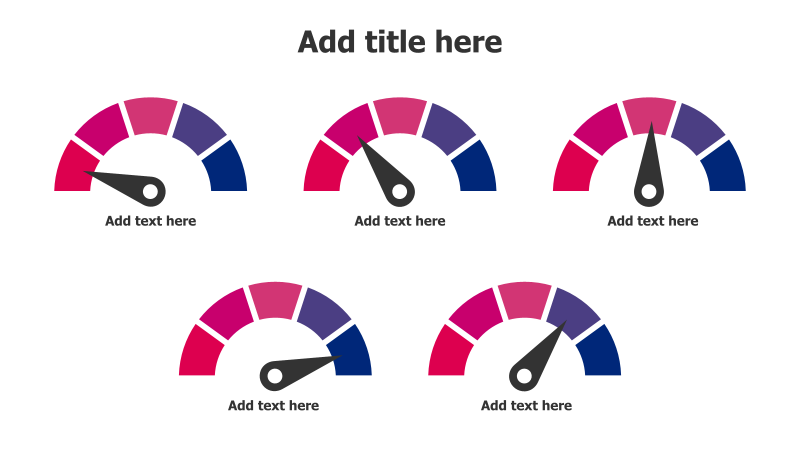
Layout & Structure: The slide displays five semi-circular gauge charts arranged in two rows. Each gauge has a needle indicating a performance level, with a color gradient transitioning from red to purple to blue. The charts are evenly spaced and provide a clear visual comparison of different metrics.
Style: The template utilizes a modern and clean aesthetic with a vibrant color scheme. The gauges have a flat design with subtle gradients, creating a professional and engaging look. The use of contrasting colors helps to highlight the performance levels.
Use Cases:
- Presenting key performance indicators (KPIs).
- Visualizing progress towards goals.
- Comparing performance across different departments or teams.
- Illustrating risk levels or severity.
- Showing customer satisfaction scores.
Key Features:
- Visually appealing and easy to understand.
- Clear representation of performance levels.
- Fully customizable colors and values.
- Suitable for a wide range of business presentations.
- Effective for highlighting areas for improvement.
Tags:
Ready to Get Started?
Impress your audience and streamline your workflow with GraphiSlides!
Install Free Add-onNo credit card required for free plan.