Up and Down Arrows Comparison
This template visually represents a comparison between two opposing trends or concepts using up and down arrows.
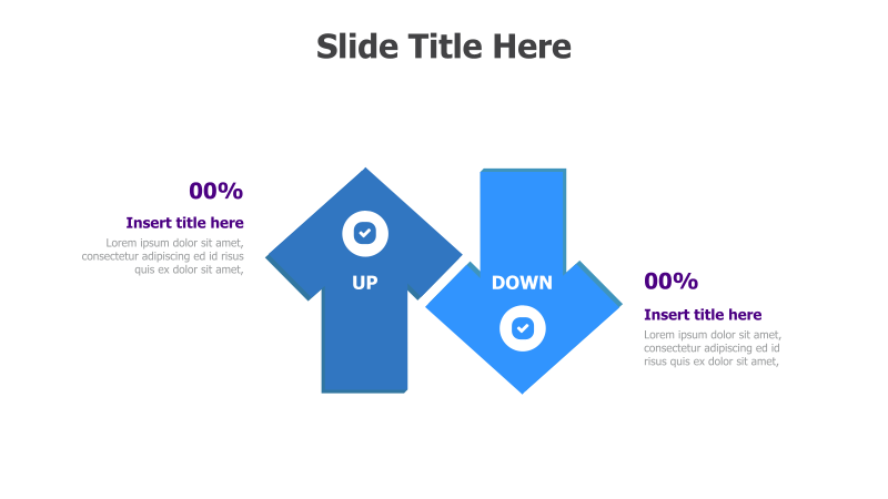
Layout & Structure: The slide features two prominent blue arrows, one pointing upwards and the other downwards, connected at a central point. Each arrow has a corresponding percentage display (currently 00%) and a text area for a title and description. The arrows create a clear visual dichotomy.
Style: The design employs a clean, modern aesthetic with solid blue colors and subtle shadows. The use of arrows and checkmarks provides a straightforward and easily understandable visual metaphor. The overall style is professional and suitable for business presentations.
Use Cases:
- Presenting positive and negative trends.
- Comparing performance metrics (e.g., sales up vs. costs down).
- Illustrating opposing viewpoints or strategies.
- Highlighting areas of improvement and areas of strength.
- Showing increases and decreases in data.
Key Features:
- Clear visual representation of opposing concepts.
- Customizable percentage displays.
- Editable text areas for detailed explanations.
- Professional and modern design.
- Easy to understand and interpret.
Tags:
Ready to Get Started?
Impress your audience and streamline your workflow with GraphiSlides!
Install Free Add-onNo credit card required for free plan.