5-Level Performance Gauge Chart
This template features a series of five gauge charts, visually representing performance levels or metrics.
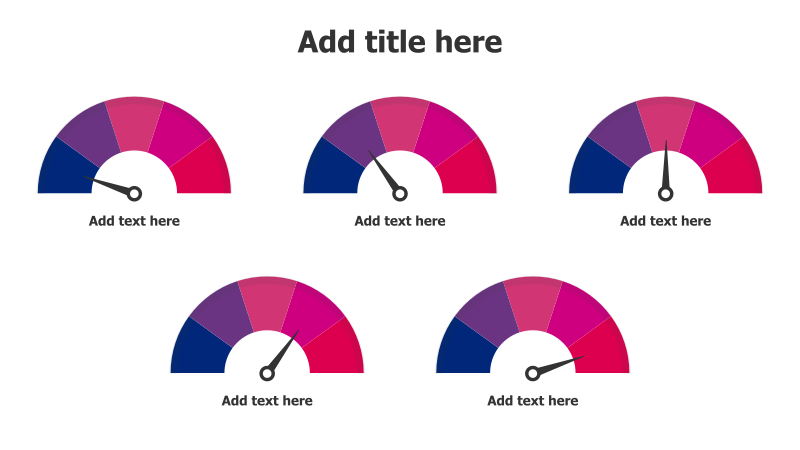
Layout & Structure: The slide displays five semi-circular gauge charts arranged in two rows. Each gauge has a needle indicating a level of completion or performance. The charts transition in color from blue to magenta to red, suggesting a spectrum from low to high or negative to positive. Each gauge includes a placeholder for text below it.
Style: The template utilizes a modern and clean aesthetic with a gradient color scheme. The gauges have a flat design with subtle shading to create a sense of depth. The overall look is professional and visually appealing.
Use Cases:
- Presenting key performance indicators (KPIs).
- Illustrating progress towards goals.
- Showing risk levels or severity.
- Evaluating project status.
- Displaying customer satisfaction scores.
Key Features:
- Visually engaging gauge design.
- Clear representation of performance levels.
- Easy to customize with your own data.
- Color-coded for quick understanding.
- Suitable for a variety of business presentations.
Tags:
Ready to Get Started?
Impress your audience and streamline your workflow with GraphiSlides!
Install Free Add-onNo credit card required for free plan.