Radar Chart Comparison
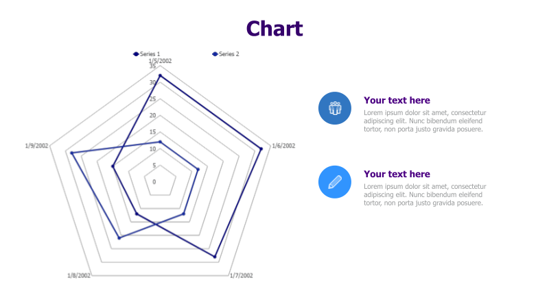
This slide presents a radar chart designed for comparing two datasets over a period of time.
Layout & Structure: The template features a radar chart (also known as a spider chart or star chart) with six axes representing different variables or categories. Two series of data are plotted on the chart, visually comparing their values across these categories. Dates (1/5/2002, 1/6/2002, 1/7/2002, 1/8/2002, 1/9/2002) are marked around the chart's perimeter. There are two text placeholders on the right side of the chart.
Style: The chart utilizes a clean and modern aesthetic with a light background. The lines representing the data series are distinctively colored (blue and dark blue). The overall design is professional and easy to understand. The chart has a subtle, transparent grid for better readability.
Use Cases:
- Comparing performance metrics across different departments.
- Analyzing customer feedback on various product features.
- Evaluating the strengths and weaknesses of competitors.
- Tracking progress on multiple project goals.
- Visualizing skill sets or competencies.
Key Features:
- Clear visual comparison of two datasets.
- Easy-to-understand radar chart format.
- Customizable data points and labels.
- Professional and modern design.
- Includes text placeholders for context and analysis.
Tags:
Ready to Get Started?
Impress your audience and streamline your workflow with GraphiSlides!
Install Free Add-onNo credit card required for free plan.