8-Level Performance Gauge Chart
This template features a visually engaging gauge chart to represent performance levels.
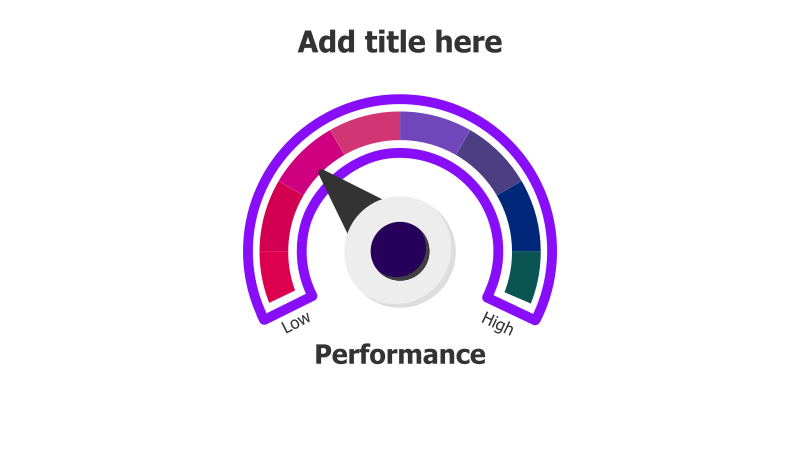
Layout & Structure: The slide showcases a semi-circular gauge with eight distinct segments, ranging from "Low" to "High" performance. A central circle and a pointer indicate the current performance level. The segments are arranged in a curved fashion, creating a clear visual representation of a spectrum.
Style: The template employs a vibrant color gradient, transitioning from red (low) to green (high), enhancing readability and impact. The use of a purple accent color adds a modern touch. The design is clean and professional, with subtle shadows adding depth.
Use Cases:
- Presenting key performance indicators (KPIs).
- Visualizing project progress.
- Illustrating risk assessment levels.
- Demonstrating employee performance evaluations.
- Showing product quality ratings.
Key Features:
- Clear and intuitive visual representation.
- Visually appealing color scheme.
- Fully customizable performance levels.
- Easy to understand and interpret.
Tags:
Ready to Get Started?
Impress your audience and streamline your workflow with GraphiSlides!
Install Free Add-onNo credit card required for free plan.