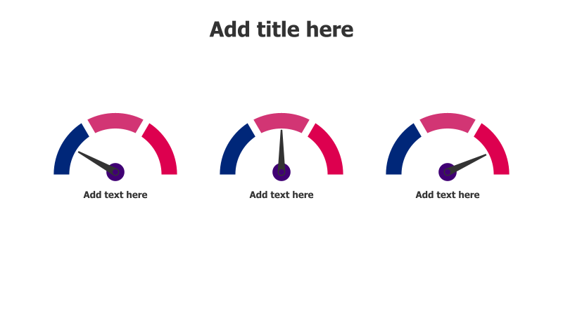
3-Level Performance Gauge Chart
This template presents a clear visual comparison of performance across three distinct levels or categories.
Layout & Structure: The slide features three identical gauge charts arranged horizontally. Each gauge consists of a semi-circular arc filled with a pink-to-blue gradient, a dark blue outer ring, and a black pointer indicating the performance level. Below each gauge is a placeholder for descriptive text.
Style: The design employs a modern and clean aesthetic with a subtle gradient effect. The use of contrasting colors (pink and blue) draws attention to the performance indicators. The gauges have a flat, minimalist appearance.
Use Cases:
- Tracking key performance indicators (KPIs).
- Comparing performance across different departments or teams.
- Visualizing progress towards goals.
- Presenting customer satisfaction levels.
- Illustrating risk assessment scores.
Key Features:
- Easy-to-understand visual representation.
- Customizable gauge values and labels.
- Clean and professional design.
- Fully editable shapes and text.
Tags:
Ready to Get Started?
Impress your audience and streamline your workflow with GraphiSlides!
Install Free Add-onNo credit card required for free plan.