6-Gauge Meter Charts
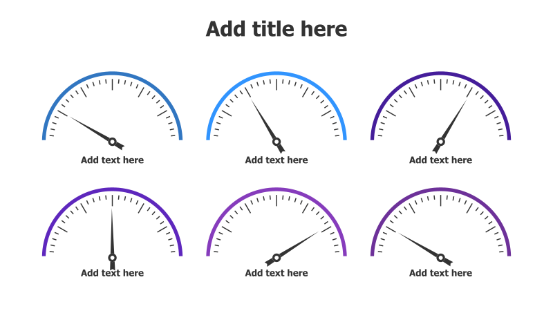
This slide features six gauge-style charts arranged in a 2x3 grid. Each chart is designed to visually represent a metric or performance indicator.
Layout & Structure: The template consists of six semi-circular gauge charts. Each gauge has a needle pointing to a value on the scale. Below each gauge is a text placeholder for labeling the metric or providing a descriptive value. The arrangement is a simple grid, allowing for easy comparison between the six metrics.
Style: The charts utilize a clean, modern aesthetic with a gradient color scheme. Each gauge has a different color (blue, purple, and variations), providing visual distinction. The use of subtle shadows adds depth. The overall style is professional and suitable for business presentations.
Use Cases:
- Tracking key performance indicators (KPIs).
- Presenting progress towards goals.
- Comparing performance across different departments or teams.
- Visualizing survey results or customer satisfaction scores.
- Displaying project status updates.
- Monitoring system performance metrics.
Key Features:
- Fully customizable colors and values.
- Clear and concise visual representation of data.
- Easy-to-understand gauge format.
- Professional and modern design.
- Suitable for a wide range of business applications.
Tags:
Ready to Get Started?
Impress your audience and streamline your workflow with GraphiSlides!
Install Free Add-onNo credit card required for free plan.