Circular Data Visualization with Elements
This slide presents a visually engaging way to display data and supporting information.
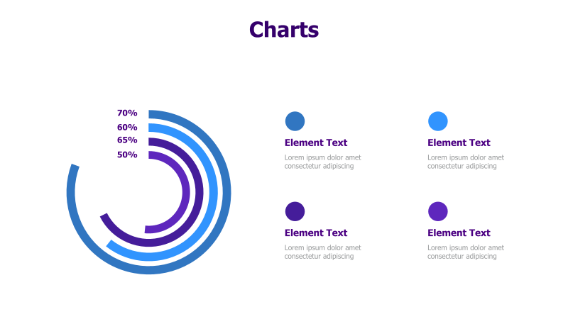
Layout & Structure: The template features a prominent circular chart composed of concentric arcs, displaying percentage values (50%, 60%, 65%, 70%). Alongside the chart, there are four distinct element blocks, each consisting of a colored circle and accompanying text. These elements are arranged in a 2x2 grid.
Style: The design employs a modern aesthetic with a gradient color scheme (blues and purples). The circular chart and element circles have a clean, flat appearance. The overall style is professional and visually appealing.
Use Cases:
- Presenting key performance indicators (KPIs).
- Illustrating market share or survey results.
- Highlighting progress towards goals.
- Showcasing different aspects of a project or initiative.
- Displaying component breakdown of a whole.
Key Features:
- Visually appealing circular chart.
- Clear and concise data presentation.
- Four customizable element blocks for additional information.
- Fully editable shapes and text.
- Modern and professional design.
Tags:
Ready to Get Started?
Impress your audience and streamline your workflow with GraphiSlides!
Install Free Add-onNo credit card required for free plan.