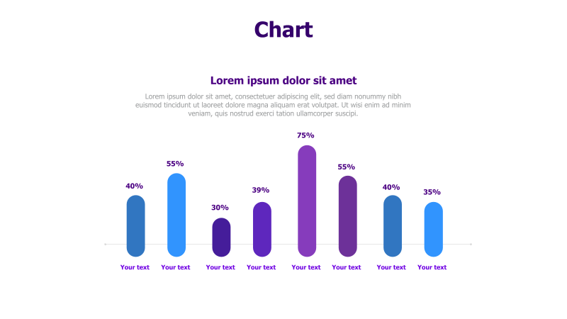
Column Chart with Percentage Values
This slide features a column chart designed to visually represent percentage-based data.
Layout & Structure: The template displays a horizontal column chart with seven data points. Each point is represented by a rectangular column, and a percentage value is displayed above each column. The columns are arranged in a linear fashion, allowing for easy comparison of values. Placeholder text is provided below each column for labeling.
Style: The chart utilizes a clean and modern aesthetic with rounded column edges and a vibrant color palette. The use of different colors for each column enhances visual distinction. A subtle shadow effect adds depth. The overall design is professional and easy to understand.
Use Cases:
- Presenting survey results.
- Comparing market share data.
- Illustrating performance metrics.
- Showing progress towards goals.
- Reporting financial data.
Key Features:
- Fully editable columns and labels.
- Clear and concise data visualization.
- Visually appealing color scheme.
- Easy to customize for various data sets.
Tags:
Ready to Get Started?
Impress your audience and streamline your workflow with GraphiSlides!
Install Free Add-onNo credit card required for free plan.